Understanding Consumer Psychology in Cosmetic Box Design
How consumer behavior and perception shape packaging appeal
According to some recent studies on how people shop, about 8 out of 10 buyers decide whether they want to buy a beauty product right after just looking at the packaging for around 15 seconds (Packaging-Labelling, 2023). That really shows why cosmetic boxes need to grab attention through colors that mean something and materials that feel good when touched. Luxury brands tend to go for those smooth matte surfaces mixed with shiny metal bits because it screams expensive quality. On the flip side, companies selling green products usually opt for packages made from recycled stuff so customers can actually feel the difference in their hands, which helps them relate better to folks who care about being environmentally friendly.
Color psychology: Using hues to trigger emotional responses and drive purchases
Red evokes urgency, making it effective for limited-edition launches, while soft pinks communicate gentleness—ideal for skincare lines. According to a 2023 ERNEST Packaging study, gold foil accents increase perceived product value by 41% compared to standard prints, reinforcing premium positioning through strategic color use.
Shape, texture, and material: Enhancing sensory engagement and perceived value
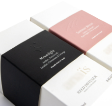
Triangular perfume boxes attract 28% more attention than square designs in shelf displays, demonstrating how form influences visibility. Meanwhile, 75% of consumers associate embossed textures with higher quality (Packaging-Labelling, 2023), and magnetic closures extend interaction time by an average of 12 seconds—boosting brand recall through enhanced sensory engagement.
Creating emotional connections that build brand loyalty through design
Personalized monogramming increases repurchase intent by 34%, according to consumer neuroscience trials. Brands incorporating QR codes that link to ingredient transparency stories see 22% higher social media engagement, transforming packaging into a narrative tool that deepens customer relationships.
Minimalism vs. maximalism: Balancing functionality and indulgence in cosmetic box aesthetics
While 67% of millennials prefer minimalist designs with clean lines, Gen Z engages 39% more with bold patterns and interactive elements like peelable coatings. The key is aligning aesthetic complexity with the lifestyle and values of the target audience, ensuring functionality meets emotional appeal.
Building Brand Identity Through Strategic Cosmetic Box Design
Defining brand personality to guide packaging visuals and tone
A clear brand personality shapes every aspect of cosmetic box design. Brands emphasizing simplicity often adopt clean lines and matte finishes, while luxury-focused labels incorporate metallic foiling and embossed logos. As outlined in the Cosmetic Brand Development Guide, this alignment ensures packaging communicates brand essence at first glance.
Aligning packaging design with core brand values for authenticity
When materials and messaging reflect brand ethics, packaging becomes a powerful trust signal. Vegan beauty brands, for example, frequently use plant-based inks and FSC-certified paperboard to visually reinforce their cruelty-free commitments. This consistency between values and design strengthens credibility in an era where consumers scrutinize corporate responsibility.
Storytelling through unboxing: Creating memorable, narrative-driven experiences
Innovative brands now treat cosmetic boxes as multi-sensory storytelling platforms. One sustainable beauty label includes seed paper inserts that grow into herbs, turning disposal into participation. As noted in recent packaging studies, such experiential design transforms routine purchases into shareable moments that deepen emotional investment.
Master the Design: How to Create Captivating Cosmetic Boxes That Drive Sales
"78% of consumers say color accuracy and font choice directly impact their perception of product quality (Pantone, 2023)—a statistic underscoring the critical role of visual precision in packaging success."
The Role of Color and Typography in Communicating Brand Tone and Product Quality
The colors we pick can trigger instant feelings in people's minds. Think about it: soft pastel shades often give off a sophisticated vibe, whereas those bright neon tones really speak to what Gen Z finds exciting these days. When it comes to fonts, serif styles such as Didot have this classic elegance about them, making them great for products aimed at mature audiences like anti aging creams. On the flip side, rounded sans serif fonts like Futura feel much friendlier and more accessible, which works well for companies selling natural skincare products. Some studies actually show that when brands stick to consistent color and font pairings across their marketing materials, customers are around 34 percent more likely to want to buy from them because there's less mental confusion going on.
Effective Layout Principles for High-Impact Cosmetic Box Designs
Designs should follow established visual hierarchy principles:
- Focal Point: 67% of shoppers notice the logo first, especially when placed in the upper third
- White Space: Minimalist layouts using 40–60% negative space elevate perceived value by 22%
- Contrast: High-contrast text-background pairings improve legibility threefold
Arrange elements along the eye’s natural “Z-pattern” scan path to guide attention toward key claims like “vegan” or “SPF 50+.”
Balance Depth:
| Design Element | Premium Perception Driver | Budget Perception Risk |
|---|---|---|
| Metallic Foiling | +29% luxury association | Overuse appears gaudy |
| Embossed Logos | +41% memorability | Poor execution looks cheap |
| Gradient Effects | +18% modernity | Mismatched hues confuse buyers |
Data Insight: 78% of consumers judge product quality by font and color accuracy (Pantone, 2023)
Sustainable Innovation in Cosmetic Box Materials and Structure
Meeting Eco-Conscious Demand: Sustainability Trends in Cosmetic Packaging
Since 2020, there's been a massive jump in cosmetic brands going green with recycled materials - we're talking around 212% growth. Customers today care about how products affect the planet, placing it just behind actual product quality when making purchases. Brands are getting creative with their packaging too, moving toward FSC certified paper boards and stuff made from agricultural waste. These new materials break down in about eight weeks, which is actually 60 percent quicker compared to regular plastic waste. The whole shift makes sense when looking at what's coming next for Europe. The EU wants all main packaging to be fully recyclable by 2030, so companies need to get ahead of these rules if they want to stay competitive in the market.
Biodegradable Inks, Recycled Substrates, and Refillable Systems Shaping the Future
Three innovations are redefining sustainable packaging:
- Algae-based chromatic inks that change color to indicate freshness
- Post-consumer recycled (PCR) glassine, offering 40% greater tear resistance than virgin fiber
- Modular refill systems that cut packaging waste by 55% per cycle
These advancements enable compliance with California’s 2032 Circular Economy Act without sacrificing aesthetic appeal.
Tactile Differentiation: How Material and Texture Elevate Unboxing Experience
Engineered textures turn cosmetic boxes into sensory brand ambassadors. Crinkle-coated hemp papers and embossed mycelium surfaces increase perceived value by 29% in consumer trials. Luxury brands report a 33% uptick in social media engagement when using biodegradable soft-touch finishes—evidence that sustainability and sensory richness now jointly influence buying decisions.
Tailoring Cosmetic Box Design to Target Audience Preferences
Mapping Packaging Design to Audience Expectations and Lifestyle
Successful cosmetic box design reflects consumers’ daily routines and aspirations. For instance, 63% of eco-conscious buyers actively look for biodegradable materials that align with their values. Skincare brands targeting professionals often choose compact, travel-ready formats with understated metallic finishes that suit office environments.
Gen Z vs. Millennials: Key Differences in Beauty Packaging Preferences
Gen Z favors bold, interactive packaging—58% appreciate QR codes linking to TikTok tutorials or recycling instructions. Millennials gravitate toward minimalist layouts with heritage-inspired typography, associating them with “quiet luxury.” While both generations prioritize sustainability, Gen Z responds more to neon-accented recycled packaging, whereas Millennials prefer earth-toned, refillable options.
Table of Contents
-
Understanding Consumer Psychology in Cosmetic Box Design
- How consumer behavior and perception shape packaging appeal
- Color psychology: Using hues to trigger emotional responses and drive purchases
- Shape, texture, and material: Enhancing sensory engagement and perceived value
- Creating emotional connections that build brand loyalty through design
- Minimalism vs. maximalism: Balancing functionality and indulgence in cosmetic box aesthetics
- Building Brand Identity Through Strategic Cosmetic Box Design
- Master the Design: How to Create Captivating Cosmetic Boxes That Drive Sales
- Sustainable Innovation in Cosmetic Box Materials and Structure
- Tailoring Cosmetic Box Design to Target Audience Preferences