Why Foldable Box Structure Is the Strategic Foundation of Brand Identity
Scalability and sustainability: how foldable box engineering supports agile branding across product lines
The foldable box isn't merely packaging it's actually a smart tool for building brands that can grow and respond quickly. These boxes collapse down to take up way less space than regular boxes do in storage areas, which means companies save money on warehouse rent and cut down on carbon footprints during shipping. Brands love this flexibility because they can switch between different products, handle seasonal items, or adjust sizes without having to spend thousands on new molds and tools. Online retailers get even more value from these designs since they can keep their brand image consistent across all sorts of products like beauty items and gadgets while using fewer materials overall. According to Packaging Digest from last year, clever engineering in these boxes cuts cardboard usage somewhere between 15% and 25% per item. And let's face it green claims matter now more than ever with almost seven out of ten shoppers checking what kind of impact their purchases have before buying anything.
Material psychology: corrugated vs. SBS — aligning structural choice with brand values (eco-consciousness, luxury, or durability)
What kind of material goes into making a foldable box actually speaks volumes about a brand long before anyone gets their hands on the product itself. Take corrugated cardboard for instance. When it shows those visible ridges and has plenty of recycled materials in there, people start associating it with genuine products that care about the environment while still being tough enough to protect what's inside during shipping. The B-flute design typically handles around 32 ECT resistance which works great when we need boxes that can take some punishment without breaking down. On the flip side, there's this thing called solid bleached sulfate board. It gives off that clean, shiny look perfect for detailed prints, fancy foil work, and intricate cuts. Brands wanting to project top quality often go this route even though it costs roughly 40 to 60 percent more than regular options. So when companies pick between these two materials, they're really making a choice about what message they want to send through their packaging choices. Corrugated says practicality meets sustainability, while SBS shouts out luxury experiences from the get-go.
Designing Brand Identity Into the Foldable Box Experience
Color, typography, and negative space: crafting emotional resonance before the unbox begins
The colors, fonts, and overall look of a foldable box speak volumes about a brand without saying a word. Take deep blue for instance it makes people think of trust and stability. Bright orange packaging grabs attention and feels friendly and energetic. The choice of font matters too. Clean sans-serif fonts give off that modern, efficient vibe, whereas those fancy serif fonts scream tradition and authority. What many overlook is the power of empty space on packaging. It's not just blank space it actually guides the eye, highlights important elements, and somehow makes everything feel more valuable. Studies from Loyola University back this up showing that consistent color schemes can boost brand recognition by around 80% when customers see products in person. Combine these design choices with eco-friendly materials such as FSC certified cardboard or recycled SBS board, and suddenly those simple boxes become much more than containers. They turn into physical representations of what the brand stands for long before someone ever opens them up. Minimalist designs with plenty of breathing room send a clear message about quality while also showing commitment to sustainability.
E-Commerce Integration: Turning Foldable Mailer Boxes into Consistent Brand Touchpoints
From pixel to package: synchronizing digital brand voice with physical foldable box execution
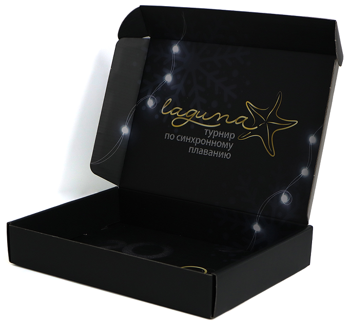
The foldable mailer box represents the first real touchpoint for many DTC brands, and in most cases, it's the only physical interaction customers ever get. These boxes create emotional connections in ways screens simply can't match, thanks to their textures, weight, how they feel when handled, and even their finishing touches. Maintaining consistency across both digital and physical experiences isn't just about looking good on paper (literally). It builds trust over time. When these mailers mirror the exact color schemes, typography choices, icons, and layout flow from company websites and social media posts, what starts as a simple delivery transforms into something memorable. Brands that stick to clean, minimal designs tend to gain more credibility as premium players, especially when using matte finishes on corrugated materials. On the flip side, companies going for bold, fun patterns that match their Instagram style create friendlier vibes that people actually want to show off. Each fold line, every crease, all those seams aren't accidents. They tell a story about brand identity without saying a word, creating lasting impressions that stay with customers long after opening day.
Premium Finishes and Print Techniques That Elevate Foldable Box Brand Impact
Spot UV, foil stamping, and tactile laminates — when and why they deliver measurable ROI for DTC brands
For direct-to-consumer brands fighting their way through crowded markets, premium finishes matter a lot more than just pretty decorations. Take foil stamping for instance—it's basically pressing metal onto paper using heat, which instantly gives products that fancy look perfect for logos, names, or those special brand touches. What starts as plain packaging becomes something people actually want to keep forever, making customers feel like paying extra was worth it all along. Soft touch coatings, velvet textures, or rough matte surfaces create real depth in packaging that makes folks want to run their hands over it again and again, showing how much thought went into every detail. These same finishes work wonders when used on materials from sustainable sources too, helping tell stories about environmental responsibility. Then there's spot UV coating, which highlights certain parts of artwork with a glossy finish. Minimalist brands love this because it lets them stand out without getting too flashy. All together, these little tricks transform the moment someone opens a package into something worth sharing online. People snap pictures, post them, tag friends, and suddenly free marketing happens naturally. Companies that use these methods smartly see around 30% more customers coming back again and again, proving that spending time on good looking stuff really does pay off in the long run for both sales numbers and building lasting relationships with shoppers.